

Today we introduced our new brand to the world.
It's not just a brand refresh, rather a holistic transformation that reflects who Nium is, our place in the evolving money movement ecosystem, and what we're building towards: the global infrastructure powering the future of money movement — where value flows instantly, globally, and with certainty across any network or chain.
Here's what changed and the work behind it.
The way money moves is changing globally
As our CEO, Prajit Nanu, wrote in February, what was once fringe is now becoming infrastructure. Stablecoins are maturing, becoming a rail alongside cards, bank transfers, and real-time payments that businesses use to send payouts across borders. Inherently programmatic in nature, they are also becoming the means to enable agentic payments.
The market is already building it:
- By mid-2025, B2B stablecoin payments represented 60% of identifiable real-economy stablecoin activity (source: McKinsey).
- Regulators defined the frameworks, from MiCA in the EU, GENIUS Act in the US, to the Stablecoin Ordinance in Hong Kong and the MAS Framework in Singapore.
- Banks and financial institutions formed consortiums, whether to launch their own stablecoins, introduce open standard infrastructure, or shape agentic payments.
Nium anticipated many of these shifts, investing in key partnerships and building digital asset capabilities to evolve our infrastructure into the reliable bridge between traditional and decentralized finance.
Here's how Nium is leading this shift:
- Launched USDC funding and stablecoin-backed cards.
- Joined the Circle Payments Network (CPN) and integrated with Coinbase.
- Acquired Cypher, a crypto-native non-custodial wallet and issuing company.
Nium evolved, so did our brand
Our previous identity served us well. It marked an important chapter in Nium's story, powering significant global growth over the past five years. But it was engineered for a different market: one where real-time payments across vast corridors was the aspiration, not the norm.
Today, real-time payments are table-stakes. The new challenge is different. As AI, digital assets, and agentic systems reshape how value moves across borders and chains, the companies that win are those built on infrastructure that doesn't break when the landscape shifts. The new imperative: certainty in motion.
That's Nium. So "Certainty in motion" became the north star for the new brand.
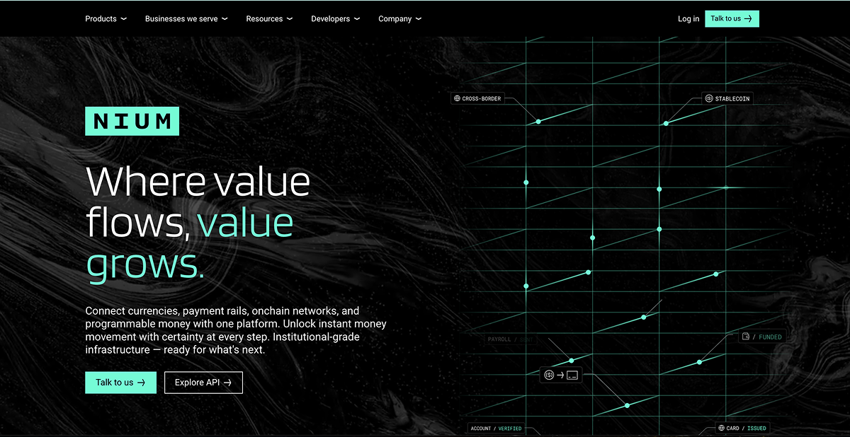
Engineering a design system, not just a look — ready for the world to come
Nium is the infrastructure powering the future of payments — where value flows instantly, globally, and with certainty across any network or chain. Our customers and partners span the full financial ecosystem: banks, fintechs, card networks, Web3 companies, AI platforms, and global enterprises building tomorrow's economy.
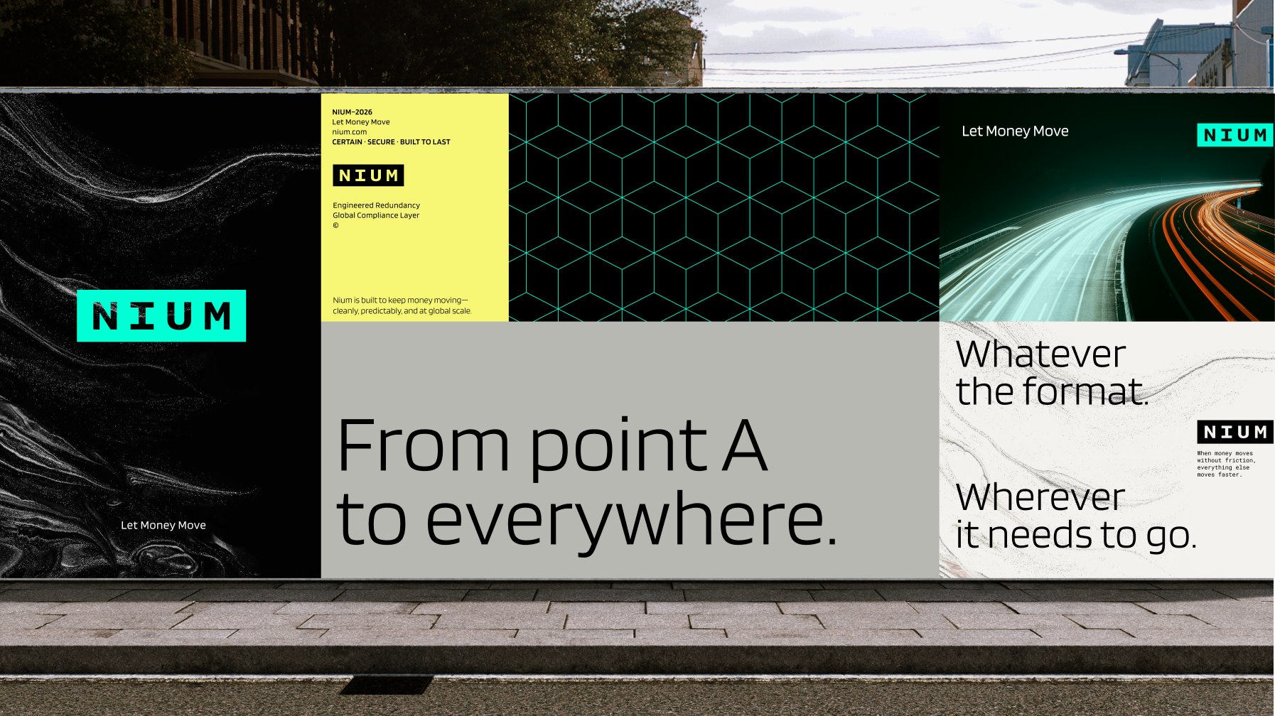
Starting with this foundation, we assembled a brand system that accurately portrays this reality.
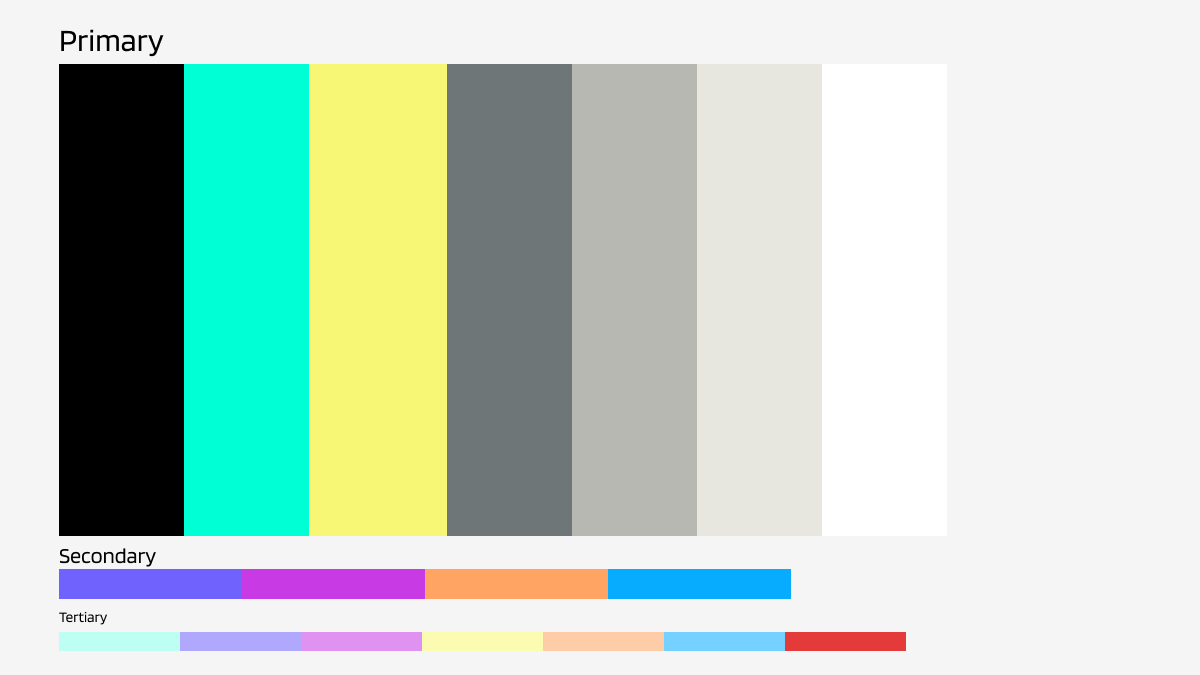
A minimal, vibrant color palette
The new palette moves away from the default category blues toward intentional, forward-thinking choices.
Minimal yet high contrast and vibrant, our new palette reflects Nium's position: intentional infrastructure that carries precision and propels momentum.
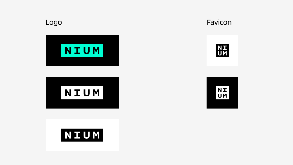
A declarative, bold logo
We decided to part ways with our standalone N in favor a full wordmark that displays our name clearly, boldly, and with vibrant energy across every surface. The wordmark eschews ornament for minimalist perfection. Bold letterforms define the space around them, evoking infrastructure, technological rigor, and the ubiquitous nature of payments across the globe.
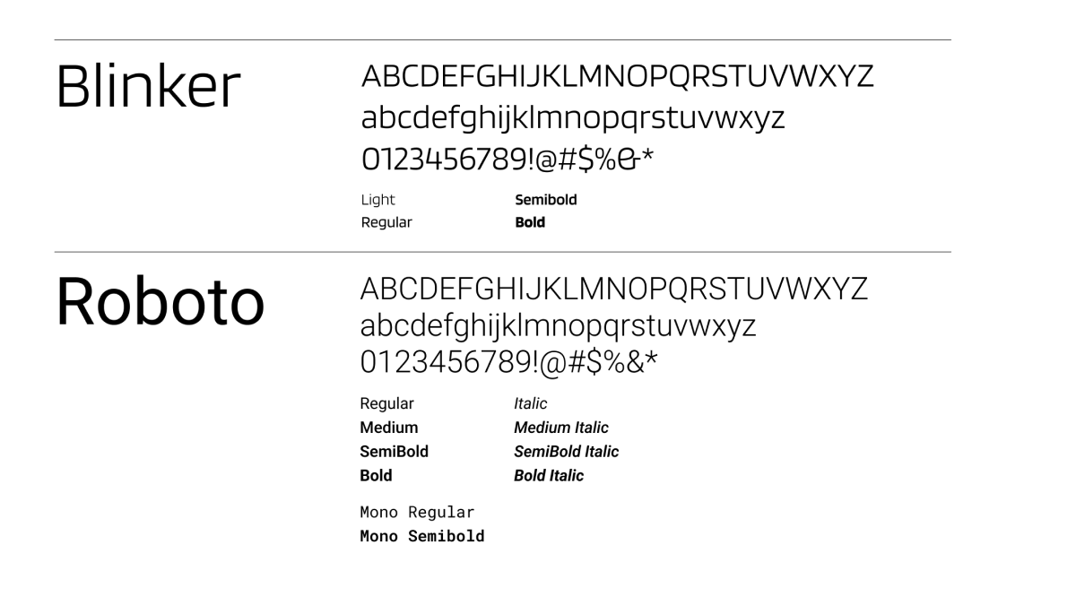
Versatile typography
We chose two open-source fonts, Blinker and Roboto, for practicality and what open source signals about transparency. Together, they create a system reflecting certainty and momentum. Blinker has just enough flair to lead in headlines; Roboto is the workhorse for body copy and UI. Both are clean, strong, and easy to read.
Scaleable building blocks
Beyond these core elements, we've defined specific rules for icons, photography, and data visualization that guide how Nium appears across every surface.
- Concrete and abstract visuals convey fluidity, adaptability, and forward motion.
- Iconography delivers a precise, high-tech aesthetic.
- Consistent, thin line weights in data visualization convey sophistication and technical rigor.
- Illustration style mirrors the graphic sensibilities of our icons, patterns, and data visualization.
- AI-powered asset creation — the design system lives in Claude Design at Nium, letting every employee generate on-brand work instantly, turning the brand from a guideline into a multiplier.
The future doesn’t wait, neither do we
At the heart of Nium is infrastructure built for scale and extended with every partnership and investment in tech we make ahead of demand.
What's different now is that you can see it. The palette, wordmark, typography, the way a chart renders on a product screen — all of it communicates what customers tell us every day: they trust Nium to solve today's and tomorrow's payments challenges.
The system is built to evolve. New rails, new asset classes, agents paying agents: as the landscape shifts, our identity is resilient and elastic enough to move with it. Projecting who Nium is: infrastructure engineered for certainty, designed to shape the next era of payments.


